

WeTransfer


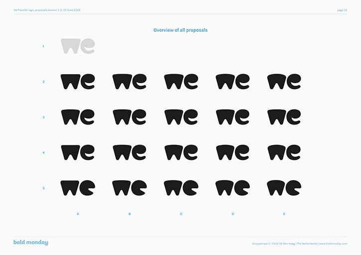
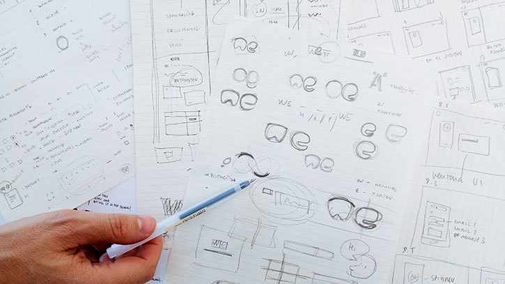
“We started with an empty canvas and a mission to create a symbol that captures the right personality, one that is technically well-executed, and can clearly be read as ‘we’.”
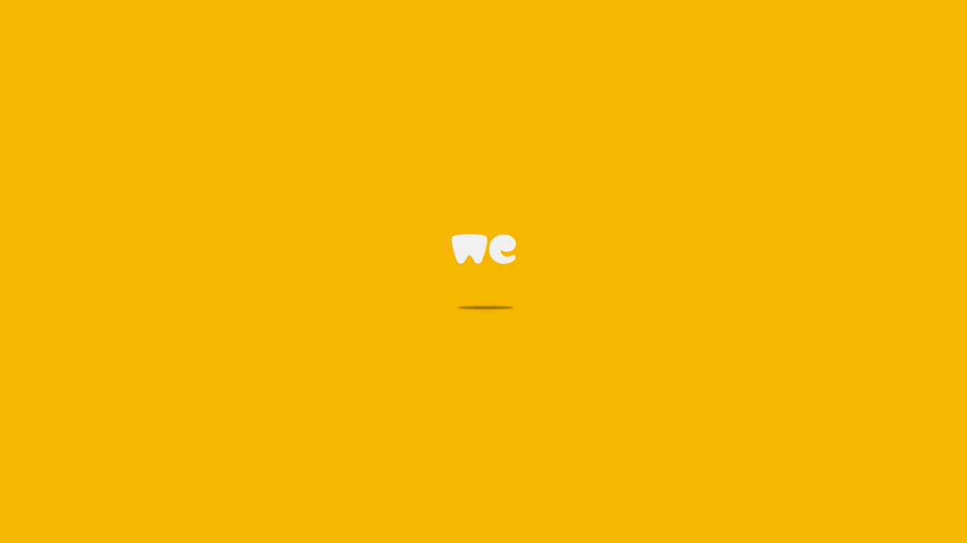
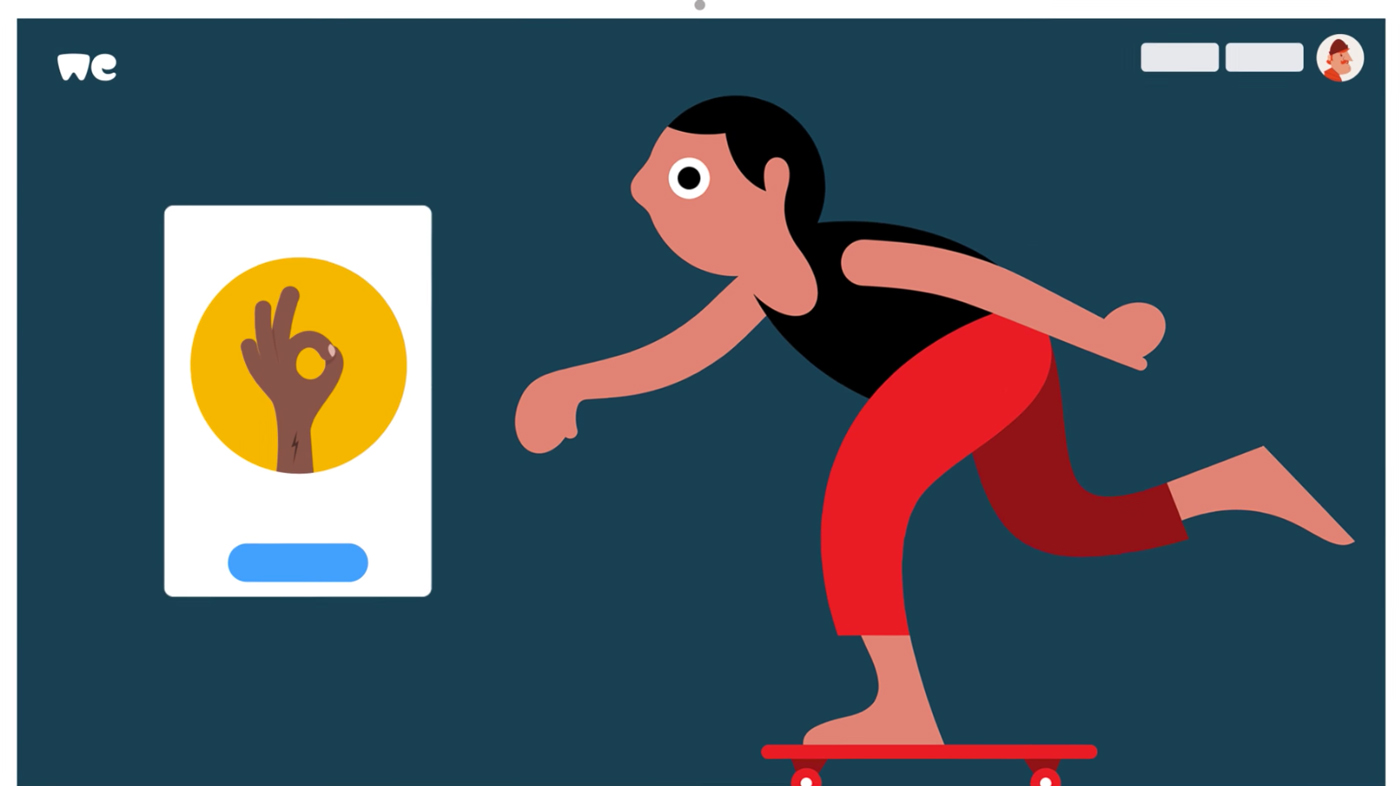
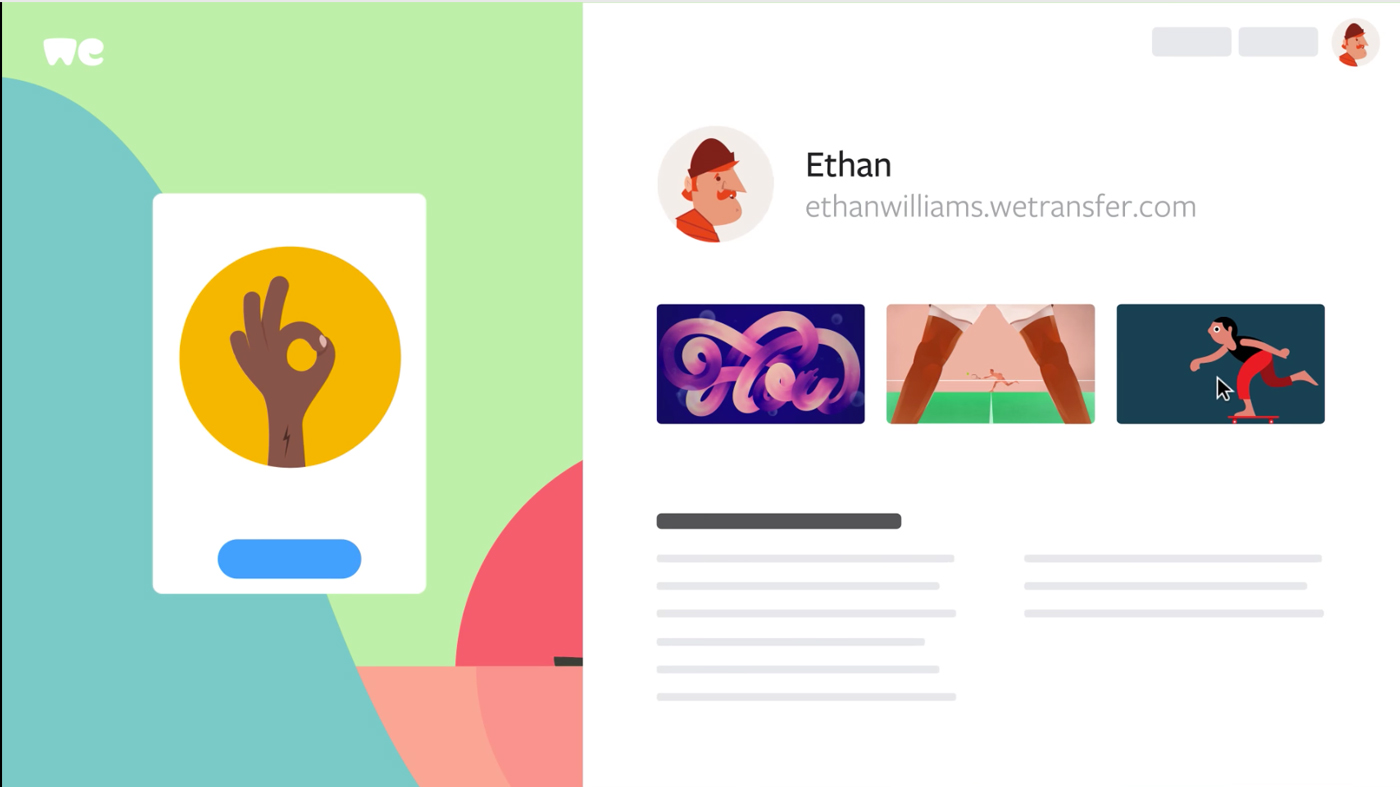
The recent launch of a refreshed new identity and design language for WeTransfer sees a bold move to a simplified new marque and dropping 'transfer' from the logo. The company continue to hero the creative works of it's user base, claiming the new direction will support this ethos further, with equal weighting to the new identity and the user experience.
"One could argue that the usability and the look & feel are of equal importance to us. We continue to allocate one third of our ad inventory to highlight photographers, illustrators, musicians and other artists. I think our new visual identity embraces creativity and the community.” - Thijs Remie, vice president of design.
GoodFromYou WeTransfer